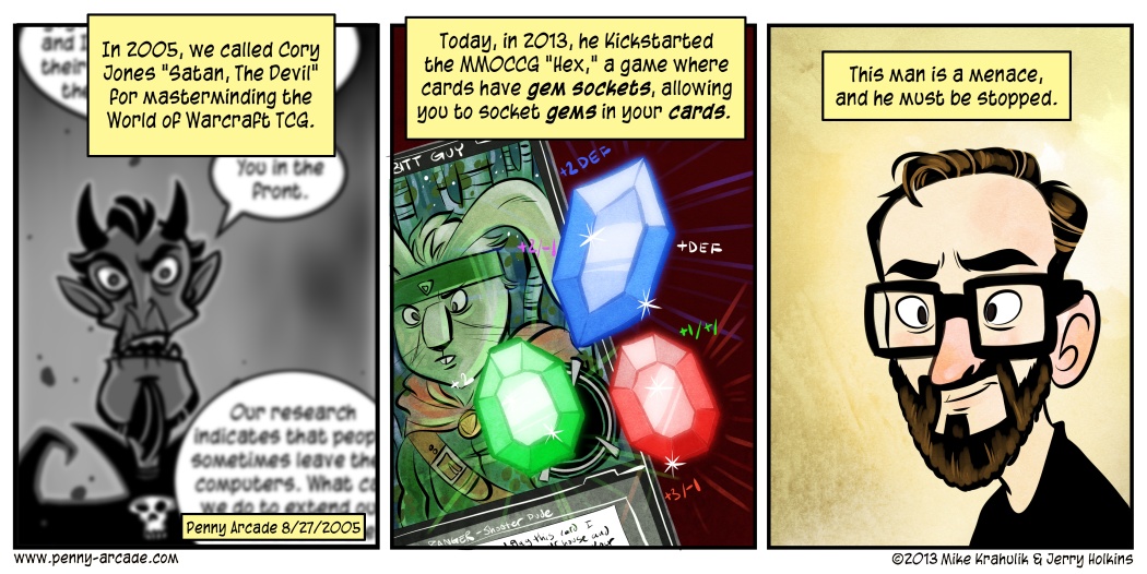
Tycho fucked up the text in today’s comic. He has the word “version” twice in the first panel. I suppose I should have caught it when I dropped the text in but honestly at that point I’m just thinking about making his disgusting words fit without obscuring too much of my beautiful artwork. It’s a delicate balancing act.
Anyway I was going to fix it this morning but decided instead to leave it and then point it out to shame him. He’s got to learn this sort of half assed textmanship isn’t going to cut it in the big leagues. I honestly expect better from him.
I posted a video yesterday on gabeart that showed me inking my Boba Fett sketch from last week. I recieved a bunch of questions about the process and I’m going to try and answer some of the main ones here.
Real quick here’s the video if you didn’t see it. I threw in a Q Unit track so if you’re at work or you hate the idea of a 50 cent and Queen mashup, you may want to turn the speakers down.
Q: Are you using a custom brush? If not, what are your pen settings?
A: Nope, it’s not a custom brush. I’m just using the regular brush tool in Photoshop CS. Here’s a quick run down of the settings:
- Mode: Normal
- Opacity: 100%
- Flow: 100%
- Hardness: 100%
As you can see, it’s pretty basic stuff. I use all the default settings on the most basic brush.
Q: How are you able to change the brush size in mid stroke?
A. I’m using the pressure sensitivity of the Wacom Tablet. Just like a real brush you can change the weight of your line by pressing harder. If you go into your Wacom tablet settings you will see a setting called “Tip Feel”. Mine is set one notch to the right of center, towards the “firm” side. It’s worth it to play around with this setting and find something you are comfortable with.
Q: How are you able to make such smooth lines?
A: Well I think it’s really a combination of things. The biggest one being practice but there are tricks you can use as well. First remember that if you’re drawing a vertical line it’s much easier to pull it than it is to push it. What I mean is that you should be starting at the top and dragging (pulling) the pen down towards your body. This will give you much more control and make for a smoother line. When going horizontal try to avoid using your wrist. Instead keep your wrist locked and pivot from your elbow. You’ll also notice that I work zoomed way in on the image. This really helps you control your lines and minimize jaggies. Beyond that just practice practice practice.
Q: Holy fuck you're fast!
A: That video is actually going at double speed so as not to be super boring. Instead of inking the entire thing in a bionic eight minutes it actually took me a much more human sixteen.
Q: How do you move around the image so fast?
A: I’m using a very handy PS shortcut to grab the image and slide it around. I’m holding the pen and drawing with my right hand but my left hand is reasting on my keyboard. If you are zoomed in on an image in PS and you press the space bar you’ll get a little hand icon. Now you can click and drag the image around. When you let go of the space bar you’re back to the brush tool.
I think those are all the big ones I got. This is essentially the same process I use when inking the comic strip. If I end up coloring the Boba drawing I’ll go ahead and capture that for a video as well. Thanks for the great response to the inking tutorial, I’m really glad so many of you found it helpful or at least interesting.
-Gabe out
